Line of Best Fit
![]()
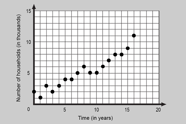
 Think back to the scatterplot presented in the Introduction. It presented data on the number of households in a local community that do not maintain a landline. A landline telephone must be connected to a network, using wire. Many households in the United States have landline telephones. A cellular telephone maintains a wireless connection to a network.
In the year 2000, cell phones began rising in popularity. Some households have decided to only maintain cell phone service, instead of having a landline in their households. The scatterplot shows data that represents the number of households in a local community that do not maintain a landline (Note: x = 0 represents the year 2000).
What patterns do you notice? How would you describe the trend of the data? Can you estimate the line that best fits the data?